Valencia: Louis Vuitton Cup: America’s Cup post # 2

The Louis Vuiton Cup is a series of sailing races that decides which of the 11 challengers may challenge the defender, the winner of the former (31st) America’s Cup (also known as “The Auld Mug”) series, Swiss Team Alinghi.

After a couple of fleet races over a couple of years (13 “acts”) where the defender also raced, now in Valencia the seconds series of round robin match races is nearing its end. To me, with still 3 races to go, it is quite clear that the four teams that will go on with the semi finals are:

  1. USA team BWW Oracle Racing
  2. New Zealand team Emirates team New Zealand
  3. Italian Team Luna Rossa Challenge
  4. For the first time in the Cup’s history ending so high: a Spanish team

It is a great event for Valencia. I wish I could be there.

Last edited by GJE on December 5, 2011 at 4:13 pm [deleted obsolete links]

Den Haag City marketing Logo launch

Indeed it was a spectacular ceremony:

The storm had passed. The rain had ceased. It remained cold and the air was full of stormy clouds. The moon showed up in 3/4 th mode. A podium was built over the pond in front of the The Hague City Museum. The scaffold had survived the Beaufort 10 force storm and not as many people as originally expected attended the ceremony.

Den Haag City Logo Ceremony 01

Last edited by GJE on December 3, 2011 at 11:38 pm

A local comedian introduced all items.
Den Haag City Logo Ceremony 02
There was a violin concert by
an orchestra of the The Hague Music Academy.
Den-Haag-Logo-Ceremony-Danc.jpg
There was a dancer.

There was a rap group. There was a pop group. There were several Aldermen explaining specific features of The Hague. There was a stand up comedian who complimented The Hague as the city of International Justice, and, being from New Zealand, the Dutch as the people who discovered New Zealand.

The Mayor explained that the logo was intended for marketing purposes only and not for the city board. He hinted that the logo referred to the Victory Boogie Woogie, the famous painting of Piet Mondriaan that is in the The Hague City Museum where the ceremony took place.

Anton Corbijn

Then Anton, shy, but far from inhibited, explained that he had lived in the UK for 27 years before he choose The Hague as his favorite city to live in. He continued that he was not allowed to use the stork and that no foreigner ever would connect a stork with The Hague. In his view the logo had to be colorful and easily reproducible by a child. He added that indeed the line represents the dunes. The kite is there, even as the rudimentary spermatozoa.

Den-Haag-Logo-Ceremony-05.jpg
The Alderman, The Mayor, Anton and the local comedian launching the Logo.
New-Logo-Den-Haag.jpg

Here is the logo: not the same as the version leaked to the press, but not so much different:

  • Grey instead of white background;
  • The word “Den Haag” (or do I read Len Laag?) in black rather than red;
  • H is wider; and
  • The red blot is less like a heart. On close inspection it seems to represent the topography of the city.

Okay, from now on one should refer to The Hague only as Den Haag, even if one doesn’t know how to pronounce it.

I am very afraid they missed the boat (or is it beat?…Den Haag used to The Beat City back in the 60ies). Why not take advantage of the fact that Anton is a famous photographer of Rock stars? How to connect Den Haag with this? Why not hint to the very effective slogan “The Hague, Royal City” or “The Hague, Royal City by the sea”?
(All photos gje)

The new The Hague City Logo: One day before take off

Since The Hague took over an Alderman from Amsterdam who introduced the successful slogan/city logo:

I Amsterdam
I Amsterdam

which slogan/city logo made The Hague envious, it is not so strange that The Hague gave the same Alderman a free hand in launching a new logo for the city The Hague – also known as “‘s-Gravenhage” or “Den Haag” or “Hofstad” (i.e. Royal Residential City) in the Dutch language.

The launch is anticipated tomorrow, 1 November 2006.

The logo has been designed by Anton Corbijn, the more famous of two famous Dutch Corbijn photographers, his brother being Maarten Corbijn, also known as Corbino. Anton became famous as photographer of pop stars like David Bowie, Miles Davis and many others, as a designer of many album covers and also for his close relation with U2 as Bono’s favorite photographer, which culminated in his recent book U2 & I (good site to listen Electric Storm of U2).

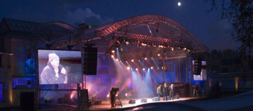
So, of course the launch promises to be a spectacle. A lot of noise was made already in a Dutch press and in the municipal board where Mayor and Aldermen had to defend their selves politically for the huge cost of the launching party, a mere Euro 192,000 for a two hour happening, or as the paper says Euro 52,77 per second. In addition there will be a wester storm to blow the 1000 invited people from the scaffold that has been erected for the occasion.

Another storm is that the logo has been leaked (or a dummy, you never know):

Leaked logo

and is already appearing on T shirts:

Leaked Logo The Hague

(Thanks AD)

This caused the local paper and a local TV station to organize a logo contest which attracted 50 entries and resulted in this winning logo:

Winning Logo The Hague

(Again thanks »AD)

But my favorite remains be this:

Old Logo of The Hague

This is a photo (by GJE himself) of a very old logo once (in 1901) belonging to the “Hofstad Fanfare” of The Hague which doesn’t exist anymore.

A fanfare is a typical Dutch and Belgian orchestra, with trumpets, trombones, flugelhorns, French horns/saxhorns, tubas, saxophones and percussion. Fanfares are usually orchestras that play walking. They walk and enhance celebrations and ceremonies usually in the open Air.

This logo shows an important element of the logo (or cote of arms) of The Hague, the stork.

Many people are fearing the stork will disappear from the logo. We will see tomorrow. The launch will be happening around the corner from where I live, so I have to have make time to have a look and let you know.